Story Finding and Visual Design

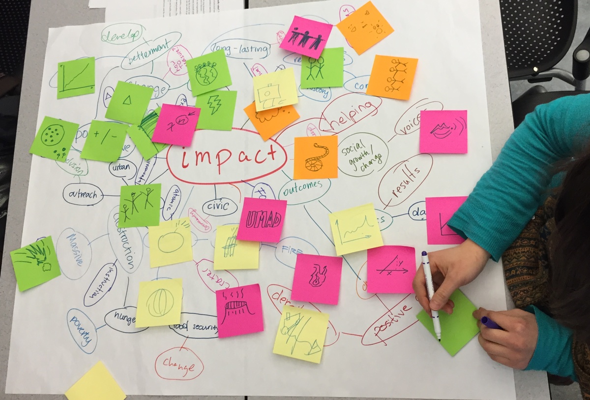
Interestingly, our story-finding began with Sasha Purpura telling us the mission of Food For Free. The goal here was not to have a story given to us, but to help us find a story in the data. “Start With the Data, Finish With a Story” mentions the importance of of having a “clearly defined objective in querying the data”. After understanding the context from Sasha’s story, we could pose questions and see if they were supported by the data. In this way, the data guided the mural’s story.

By going through Rahul’s taxonomy for data stories, our approach was similar to that laid out in “Data Stories”. Specifically, we looked at changes over time, associations, and comparisons. While it was not as common, we also used the “blacklist” approach described in “Start With the Data, Finish With a Story”. For example, my group looked at the quotes, which were quite positive, trying to identify something that recipients still needed. Our examination indicated that there isn’t much dairy rescued, which could be an interesting story to pursue.

At the end of story-finding, we wrote the story in a couple short sentences. “Start With the Data, Finish With a Story” says that a data story should “hit [readers] with a headline figure that makes them sit up and take notice”. By writing the story so concisely, we were able to make our mural communicate the “headline” of the story.

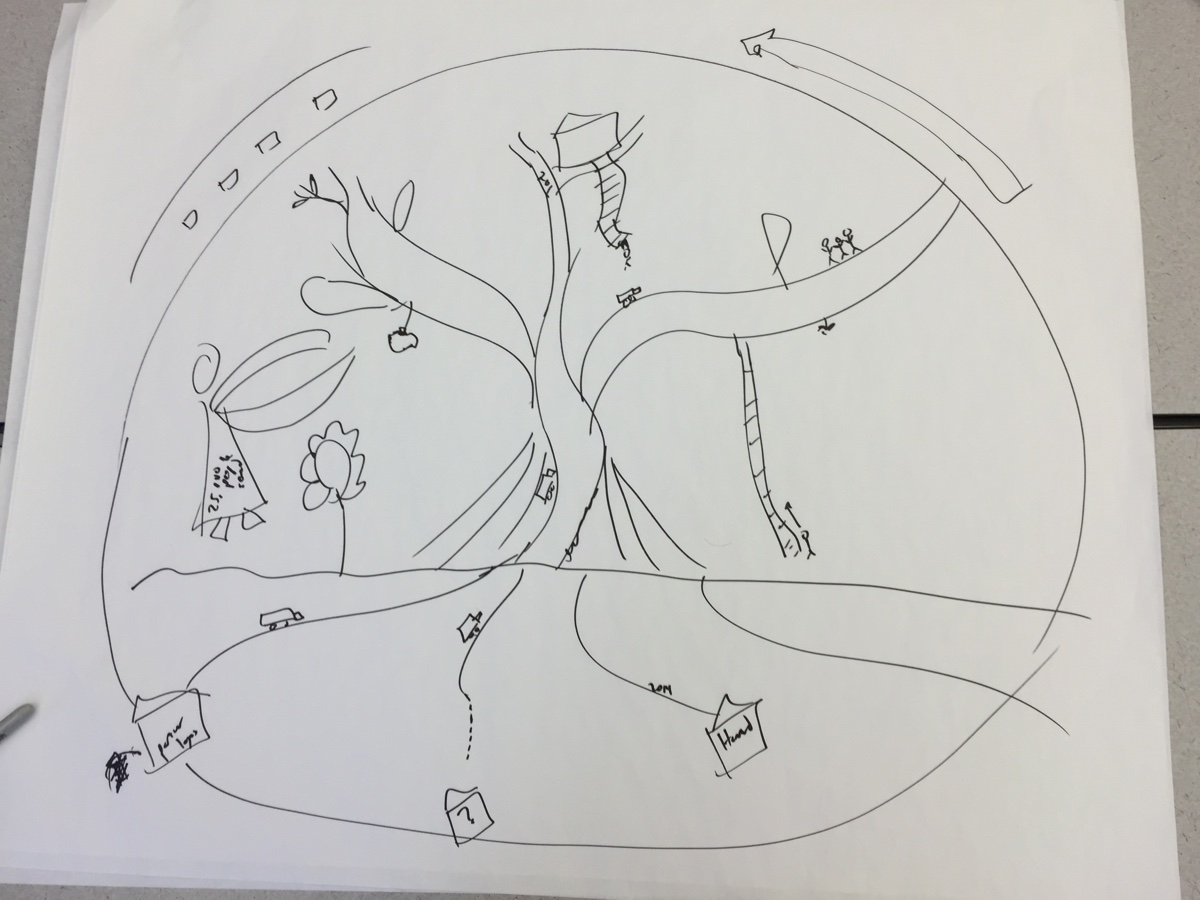
Since it is not interactive, our data mural is primarily author-driven. However, as ceriley mentioned in the post below, it is partly reader-driven because the reader may choose what to focus on. The mural design contains a number of small components (ex. trucks coming up roots, donor names on the buildings on bottom, actions of individual people) that are not as immediately noticeable as the tree itself. Unlike other visual narrative styles, such as infographics, the mural does not prescribe an order for the reader to follow. Instead, the reader is free to examine each component in any order. In this way, we can argue that it is partially reader-driven.

Although it is not a video, since our design contains several components, we need a way to preserve continuity as the user looks at different parts of the mural. Continuity is maintained through the tree – all the components (ex. trucks, donors, people) are interacting with the tree in some way.

Our Visual Design Process

Our story-finding process began with looking at a bunch of data connected by the fact that it related to Food For Free, and we needed to construct a meaningful message about their organization, supported with their actual impact on the local communities. This initial search was summed up in something the Data Journalism Handbook briefly mentioned — “key terms don’t always give you what you want, sometimes you have to sit back and think about what  you’re really asking for.” We couldn’t just look at the data and pull out the biggest numbers or the most shocking facts, although that was a starting point to get ideas flowing in groups. Eventually, we had to step back and see how the data was interconnected to create a larger, more powerful story; one where someone who sees our mural “should almost be able to read the story without having to know that it comes from a dataset.”

When we were actually designing the mural, it felt like our group work revolved around the design principles in the Segel & Heer reading without actually mentioning them by name. In brainstorming the words and associated symbols, we figured out visual mechanisms to highlight particular story elements and how much messaging to include in our final mural design (solely pictures or which statistics to include). When we did the pass-along drawings and gathered as a group to work out a draft for the final design, we figured out how to combine different elements to visually structure both the mural and the narrative to make sure we were conveying the story effectively.

I’d be curious as to what other people think about the author-driven/reader-driven nature of designing a mural, because it seems to be a little bit of both. On the one hand, we curated its development and created the story we wanted to tell — the community viewing the mural isn’t going to see the pages of data about Food for Free unless they actively search for them. On the other hand, once the mural is painted, it is entirely out of our hands and is up to the viewers’ interpretation. Even though we tried to highlight certain ideas, it’s up to the people who look at the mural to notice the details (or not) and start conversations about it (or not).


Data Story Design for Food for Free

We blended a number of different techniques to facilitate our exploration of the data story behind Food for Free’s mission. In contrast to the paradigm of “start with the data, finish with a story” that is described by the Data Journalism Handbook, we started the design process for our data mural by listening to Sasha Purpura, Executive Director of Food for Free, talk about the ethos and mission behind Food for Free, and the impact that the organization has had thus far in the local community. By listening to her first-hand account of the story behind “Food for Free”, we seeded our data exploration with a big picture idea of how Food for Free operates and its role in addressing a well-defined and critical piece of the broader issue of Food Security.

After that, we jumped into a few collaborative design exercises to openly explore the available data and hone the data story that we are directly expressing through our data mural. First, we employed a framework to develop data stories through identifying interesting factoids/outliers within the data, examining surprising correlations and interactions between different data points, analyzing how the data changes over time, revealing comparisons within the data, and also leveraging what we know about our local community to infuse the data story with personal experiences. These techniques are very similar to those described in the Data Journalism Handbook for developing context for data stories.

As a class, we discussed the individual data stories that emerged from our exploration, and developed visual designs through a group drawing exercise. Similar to some of the design strategies highlighted by Segel & Heer in their framework for narrative data visualization, we eventually developed a cohesive design to visually structure the data story, and highlighting specific motifs and patterns within the data itself. Since our data mural fits within the author-driven genre of narrative visualization, it provides a visual metaphor telling a focused story about Food for Free. It differs from many of the the case studies presented by Segel & Heer since it lacks the aspects of interactivity and transition that are typically present in data visualizations presented with a more reader-driven perspective.

Designing a Food for Free Data Mural

To kick off our class, we’ve been creating a data mural for Food for Free, a fantastic local non-profit with a large food-rescue program.  Once we turned their data into a story, we spent a class turning that story into a visual design to paint as a mural!  This was a fairly standard data dural process, though very short on time, and I tried some new things to connect the visual back to the data it started from!

The Story

We started off by reminding ourselves of the story we found in the data:

FullSizeRender 2

Seeding the Visual Design

First we did some word-webs to try and make some of the more abstract words concrete.  This activity helps by giving us a visual vocabulary we can pull from while designing a image-based narrative.  For this story, I choose to pull out the words impact, partner, waste, and security – we made a word web for each. Here’s the one the students made for impact:

word-web-impact

Then we did our pass-around drawing exercise, to try and turn the data-driven story intro a visual narrative.  The students made a ton of great drawings:

pass-around

I introduced a few new wrinkles to this activity this time around.  On the second-to-last pass, I asked students to look back at the word-webs and see if each of those key concepts was incorporated in the drawing in front of them.  If one wasn’t, I asked them to try and add it.  In addition, on the last pass, I asked students to look at the design and back a the initial data handout.  If there was a piece of the narrative that could be linked-to and supported-by some of the data easily I asked them to add it.  This change brought us back full-circle to the data we started with, and helped us keep the visual narrative connected well to the qualitative and quantitative data it came from.

Synthesizing a Mural Design

Looking at these all together, we saw some commonalities that we really liked:

  • Food for Free was represented by a truck a lot
  • the recipients of their services were almost always drawn as people, while the donors were drawn as buildings
  • there were a lot of roads being used a scaffolding to connect visual elements
  • there were a number of drawings that used plants to symbolize growing

After discussing these, and other observations, we decided to go with a tree as the central visual metaphor.  The roots would be the donors; the trunk would bring food to the leaves where recipients could pick off fruit and eat it.  Food for Free trucks would be like little ants, moving up and down the roots and tree.  Here’s the super-rough sketch I put together during the discussion in class:

sketch

Next Steps

Over the next few days, my collaborator Emily will turn this into a polished design and we’ll prep a canvas for it.  In the next class, we’ll paint it!  We only have an hour and a half, so the design won’t be too complicated.

A Data Story about Food for Free

To kick off the semester we’ve welcome Sasha Purpura, the Executive Director of Food for Free, to share some of their food rescue data and information about food rescue and food insecurity in the US.  Food for Free does food rescue, and other programs, in the area of Cambridge, MA.  Students pored over a Food For Free Data Handout we created, looking for stories they might want to tell.

food-for-free-logo

This is a bit of a departure for the data mural efforts, as all past ones have involved the community group themselves, and the people they serve.  This one, however, is being designed by the students in the class, not Food for Free staff and program recipients.  Work acknowledging, but not a barrier to the process.  This mural is primarily an exercise for the students in the low-tech story-finding and visual-design; the secondary goal is to deliver something of use to Food for Free.

Each of the four teams found a story they wanted to tell:

story1

story4

story3

story2

As you can see, they ranged from very focused, to more broad.  Two of them focused on Cambridge, while others looked at impact.

In abbreviated version of our story-selection process, we defined a criteria for selecting a story and then decided to go with a merged story that I proposed:

The data show that Food for Free is growing our work with local partners to have an even greater impact on the issue of food security in Cambridge.  We want to tell this story because there is still food waste in the area and we want to bring on more partners to help us fulfill our mission.


Data, data everywhere

A laundry list of data I produce in a 24 hour period:

  • Times blinked
  • Breaths taken
  • Number of heartbeats
  • Blood pressure
  • Steps walked
  • Calories burned/consumed
  • Daily [insert important OR unhealthy vitamin/nutrient] intake
  • Cups of water drank per day
  • Energy/carbon footprint
  • Trash generated
  • Words spoken
  • Words typed (WPM?)
  • Number of people interacted with
  • Emails, texts, IMs read/written
  • Minutes on phone
  • Number of times glancing at phone
  • Cellular data usage
  • Internet data usage
  • Internet browsing data, ad trackers/cookies
  • Location services/geolocation data
  • Time spent doing things/where (i.e. calendar data)
  • Minutes (hours, really) of video watched (episodes of television, YouTube videos)
  • Minutes of music listening
  • Minutes spent surfing the internet
  • Minutes spent playing video games
  • Total time spent looking at screens
  • Money spent (cash/credit)
  • Purchases made/businesses they were made at
  • Apps used
  • Websites visited
  • Tabs open
  • Search engine queries
  • Links shared
  • Tweets written
  • Facebook likes
  • Social media impressions (likes, mentions, retweets)
  • Photons received
  • Hours slept
  • Visits to the bathroom
  • Weight gain/loss
  • Height gain/loss
  • Hours worked
  • Salary earned
  • Mail received
  • Word frequency (“actually”, “obviously”, “literally”, “classic”)
  • Emojis/stickers used
  • Lines of code written

A [snow] day of data

Note: For the sake of brevity, there are a few pieces of data that are generated continuously.

Things like:

  • Checking email (email read data, email read receipts) – I check my email extremely frequently.
  • Pedometer data (Health data on iPhone 6)
  • Checking social (Facebook, snapchat, GroupMe, Slack)

Main log:

  • Wake up – check smartwatch for daily notifications
  • In-depth email checking on iPad
  • Check Facebook (generate view data)
  • Send a snapchat (read receipts)
  • Check Groupme (read receipts)
  • Google search (“Is the T running today”)
    • Google Chrome anonymous browser statistics generated
  • Make a payment with MITFCU debit card
  • Tap ID on senior house, added to visitor log
  • Check email
  • Google search (variations on “seinfeld episodes”)
  • Send text messages
  • send Facebook messages
  • Watch Seinfeld episodes (Generate views on website)
  • Send Facebook messages
  • Download episodes of ‘Better Call Saul’ (Generate internet traffic statistics, views)
  • Send Text messages
  • Open Computer (generating usage statistics)
  • Using browser (usage statistics)
  • Searching Piazza (view data)
  • Search email (search results
  • Login to 6.815, change password (view data, sign-in log, change in db)
  • Writing code (IntelliJ usage statistics)
  • Git commits and pushes (creating commits, trackable history online)
  • Watching ABC with xfinity on-campus (login log, TV view information) (Fresh off the Boat)
  • Purchase a pizza (Creating an order, payment log on MITFCU)
  • Tap ID for EC (Entry log)
  • Tap ID for Senior house (Entry log)
  • Watch Youtube (view data, added to recommendations for user)
  • Visit a blog (view data)
  • Play music on Spotify (usage statistics, playback logs)


A Day of Tracking down Data

Date: 2/11/2015 (Wed)

7am

  • check time using my iphone and go back to sleep

8:45am

  • Waken up by alarm, snoozed the alarm, drank water (~three gulps out of a pitcher)
  • Ate a yogurt, two eggs for breakfast. While eating, look outside through window and realized it started to snow again. i.e. gathered information about today’s weather.
  • Attempted to check the weather/temperature using iphone, but it took too long (perhaps it was also trying to get out of its sleep mode too) and I didn’t really need/want to know the temperature, so I closed my phone.

9:00am

  • check time again and rush down to BC gym for  morning exercise.

9:03am

  • Started biking: the machine kept track of the calories, resistance, speed, heart rate, muscle used throughout my workout.

10:10am

  • Checked the time, logged into gmail using my iphone
  • Took an elevator to get back to 5th floor.

10:19am

  • Used bathroom: some system in the dorm must have been keeping track of how much water I used, the electricity used to light the bathroom and heat up the water.

11:10am

  • Bought a cup of coffee and payed using my credit card.

11:15am

  • Swiped my ID in order to get into the Athena Cluster
  • Logged into the computer using my ID and password

11:30am

  • Logged into my gmail, read emails, filter out spams, added two important events to attend on the google calendar.

12:18pm

  • Create a google doc to record this document

1:10pm

  • Used my BOA online account to make transfer between my accounts
  • Bought lunch from Anna’s and used my credit card to pay
  • Checked my Facebook and replied to messages: FB kept track of not only the messages I wrote but also in which city and at what time I wrote the messages

2:20pm

  • In 6.033 Lecture, I answered an in-class vote

5:00pm

  • Swiped my ID to get into the Margarat Cheney’s room

5:30pm

  • Used an elevator in Rotch
  • Used a printer to print a problem set for 6.045 and readings for 6.033

6:50pm – 9pm

  • Answered an application survey on Piazza Career
  • Emailed a9 interviews and answered their questions
  • Searched on google a bunch of things (such as ‘what is UNIX’, ‘Trailing dot in DNS’, and ‘Regular Expression distributive?’)
  • Logged into Stellar to check psets and readings

10pm-11pm

  • Swiped my ID to get back into my dorm
  • Signed on the “get-better” card for Peggy
  • Set up an alarm for tomorrow morning
  • Practiced some javascript and saved the script on my laptop’s memory
  • Posted a short daily write-up on the blog
  • Listened to Pandora: marked “thumbs-up” or “thumbs-down” to indicate my preference based on which Pandora recommended the subsequent songs

What Do We Want to Learn?

To help me focus the various modules, I asked everyone to write up some sticky notes indicating what they wanted to learn from this course.  Certainly there is an aspect of “you don’t know what you don’t know”, but the exercise is still valuable for me.  These goals line up very nicely with the syllabus I have planned!

what do you want to learn

Here is the typed-up list:

  • working with unstructured data
  • image design
  • data -> story
  • data visualization tools
  • what defines effective data presentation and how to achieve it
  • telling a compelling story
  • data cleaning tools
  • use-cases and lessons learning
  • implementation in community (experience or) how to
  • technical and design visualization skills
  • what is valuable data?
  • how to better use the data as a narrative
  • best ways to visualize data in different contexts
  • where to go for data
  • develop me creative thinking skills
  • what is an effective visualization?
  • the process of going from an idea to implementation and how you know if you are successful or if you need to revise
  • what makes effective visualization (tools / concepts)
  • when to use what type of presentation
  • statistics!  what does the data mean
  • data storytelling, digital tools ( for cleaning, collecting, presenting)
  • filtering data
  • different ways to present (apart from video or graphs)
  • techniques on storytelling
  • ethical data visualization
  • turning quantitative -> qualitative (w/out losing meaning)
  • making websites beautiful
  • overview of all methods to do data projects
  • data processing tools
  • how to see patterns and interesting (?) in numbers
  • techniques for effectively representing data for social justice
  • new tools and strategies
  • narration building / story boarding
  • (internet-based) data mining skills!
  • meaningful info from data
  • what makes people change minds
  • have a chance to apply good design principles
  • how to make data beautiful!
  • how to make data viz visually appealing / design language
  • related fields / areas of work and theory
  • how can you make complex ideas accessible without losing clarity
  • background overview
  • databases / data cleaning
  • ways to engage different communities with data
  • effective ways to visualize data (design focus)
  • types of visualization (ex. beyond basic charts / plots)
  • how to most effectively use context
  • hands on experience with data and compare different visualizations
  • how to leave a lasting impression

Learning from Each Other

One of our first activities was to assess what skill sets people had in the room.  I am particularly interested in opportunities for us to all learn from each other, so we spent some time having folks indicate whether they were a novice or an expert on the following topics:

  • data munging
  • graphic design
  • statistical analysis
  • visualization
  • writing

Of course this type of work needs more skills than that, but these are some keys ones.  It turned out that we have a good distribution of skills levels on all these topics!

Here are the big papers we used, so you can see for yourself!

data design stats viz writing